
 As mere unknowing muggles say, "Do not judge a book by its cover." It may apply to real life people but to actual books? Instant judgement is an automatic instinct, as experienced readers are very aware of. It's both a blessing and a curse.
Disclaimer: We pray for cover changes. Constantly. Also, the titles are in no apparent order and they are only those I've read.
1 Tales from the Shadowhunter Academy
Puzzles are fun, sure. Puzzles in book covers are interesting, sure. Just guarantee that the big picture is worthy enough to be pieced together.
The Shadowhunter books by Cassandra Clare have the history of questionable cover choices. Contrary to some existing belief, using people on book covers aren't always appealing. It's a huge gamble. Thankfully they've taken note of this and mended those of the Mortal Instruments and the Infernal Devices and doing a great job so far with the ongoing Dark Artifices trilogy.
However, they've unfortunately left this novella-series untouched.


You see what I mean? Do you? If this were a jigsaw game, I wouldn't even try.
2 Bane Chronicles

Exhibit B. Fun fact: It's also in collectible jigsaw puzzle format which I will mercifully spare you from seeing. Google at your own risk.
3 Throne of Glass
Exhibit C. A. Pretty girl, not so pretty cover.

Exhibit C. B.
 While I know of some who has forgiven this animated cover change, I still find myself at a disapproval, although it is definitely bearable than its predecessor. I am simply not a fan of people-centered covers whether with models or really artistic drawings. Yes, Julienne, this means that I don't like the Trials of Apollo or Magnus Chase covers, too.
(But like the law, there are exceptions.)
4 I Was Here
The book was great - stirring, touching, raw, emotional. The cover? Not quite. The font and the fucking yellow font size just screams "I'm made with Powerpoint!", among other things.

5 Partials Trilogy
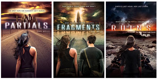
If you checked my reviews, you'll know I enjoyed this trilogy but I was thankful to have read it in ebook because to have these covers in physical copy is just. no. I mean, how much Photoshop went into making these? The skylines with the titles would've been fine on their own.
6 Hex Hall Series

You gasped, loudly, with eyes wide open and disbelieving. You point a shaking finger at me, "Why?"
When I close my eyes, I could tell you that the Hex Hall series is my guilty pleasure. It was surprisingly fun and light. (I read it three years ago.) But if I'm caught with these covers, I'll be in total denial. If the Partials trilogy went through too much Photoshop and I Was Here enjoyed Powerpoint, the Hex Hall series would be their lovechild. I mean seriously, could you have at least used complimentary colors?
To those gifted enough not to see the mistakes in these covers, I genuinely admire you. I'm not credible enough to call myself a designer of any sorts but I do have experience with design and reading. Trust me, putting people on book covers are giant risks.
Why do I have a burning passion against them, you may wonder?
For one, they break the reader's imagination. Mostly, these people represent the main characters one will get to know throughout a book. As a reader journey's along with the story, they learn about the(se) character(s) on a - hopefully - deeper level and a single image on the cover, no matter how beautiful the model or accurate the features are, will never fully embody the character(s).
Usually, faceless models work around this as they retain the mystery of the character being presented while also serving the atmosphere of the book itself. Few examples are Lady Midnight, The Host, and the Mara Dyer Trilogy.
Second point which is very evident in (some) Riordan books, there are too many elements. Modern day prefers the minimalist style not only because of aesthetic but also because it is light and uncrowded. Breathable. While I don't consider Riordan covers to be the worst, they've definitely got those aspects down along with the really bright and contrasting colors that gets painful too look at for too long, especially with the more recent releases.
I would say the Peculiar books by Ransom Riggs and The 5th Wave by Rick Yancey balance the human element with vague aspects of the story that surrounds it.
I don't fault anyone for these horrible covers. No matter what, there was still effort involved (I believe) and processes to go through and I recognize that. But I do hope that publishers and designers look twice or thrice (with other's eyes, too) before releasing anything to the masses.
No comments:
Post a Comment