

One of the best things of getting the physical copy is feeling every inch of the cover with your own hands and seeing it live, right in front of you or proudly displayed on your shelf. Nothing could ever beat that.
*Titles below are in no particular order.
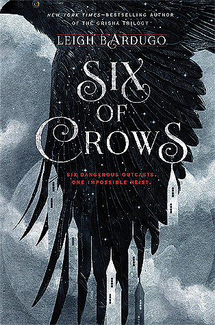
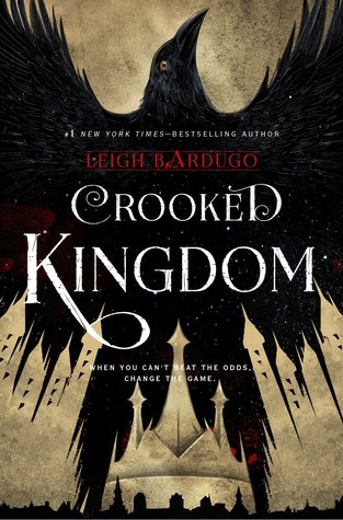
1 Six of Crows/Crooked Kingdom
This list would never be complete without one of my favorite series of. all. time. Look at these beauties. Especially the black and red pages. I. DIED.

2 Lady Midnight
I normally do not like people on book covers but Lady Midnight is one of the huge exceptions and is my most favorite cover among all the Shadowhunter books. (I'm sorry, Infernal Devices.) It's has a simple design - a girl with a sword underwater - that holds enough of a mystery without adding extra unnecessary details.
 |
| The physical copy has a higher contrast, thus a darker tone, making the background elements more ominous to the eye. |
 While I am sad to not have a physical copy of this amazing book, I have seen the actual cover for myself and there are no regrets in adding Ruined to the list.
Honestly, with the digital version, the design looks bland and quite ordinary but the physical version, the colors pop out more. The white background is more pearly that perfectly contrasts with the "swirl stencil" (what are these called again?) design while the text is more golden and the rings/sword are darker.
*This is why you can't always trust digital images. It's just prettier in real life.
4 Night Circus
 I appreciate good, creative design when I see it and the cover for The Night Circus is definitely something to admire. The animation fits perfectly with the content of the book itself - a surreal circus act with something beyond the surface. The colors are limited and almost in negative space, capturing attention. The red, aside from being pretty beside the neutral tones, matches the theme of the actual Night Circus essentially captured within the book.
5 Carry On
While I don't usually lean towards bright colors, Carry On is a huge exception. The color play on the white background was really well done, exhibiting both the playfulness - it is fan fiction - and the seriousness - with its own plot and twists - simultaneously.

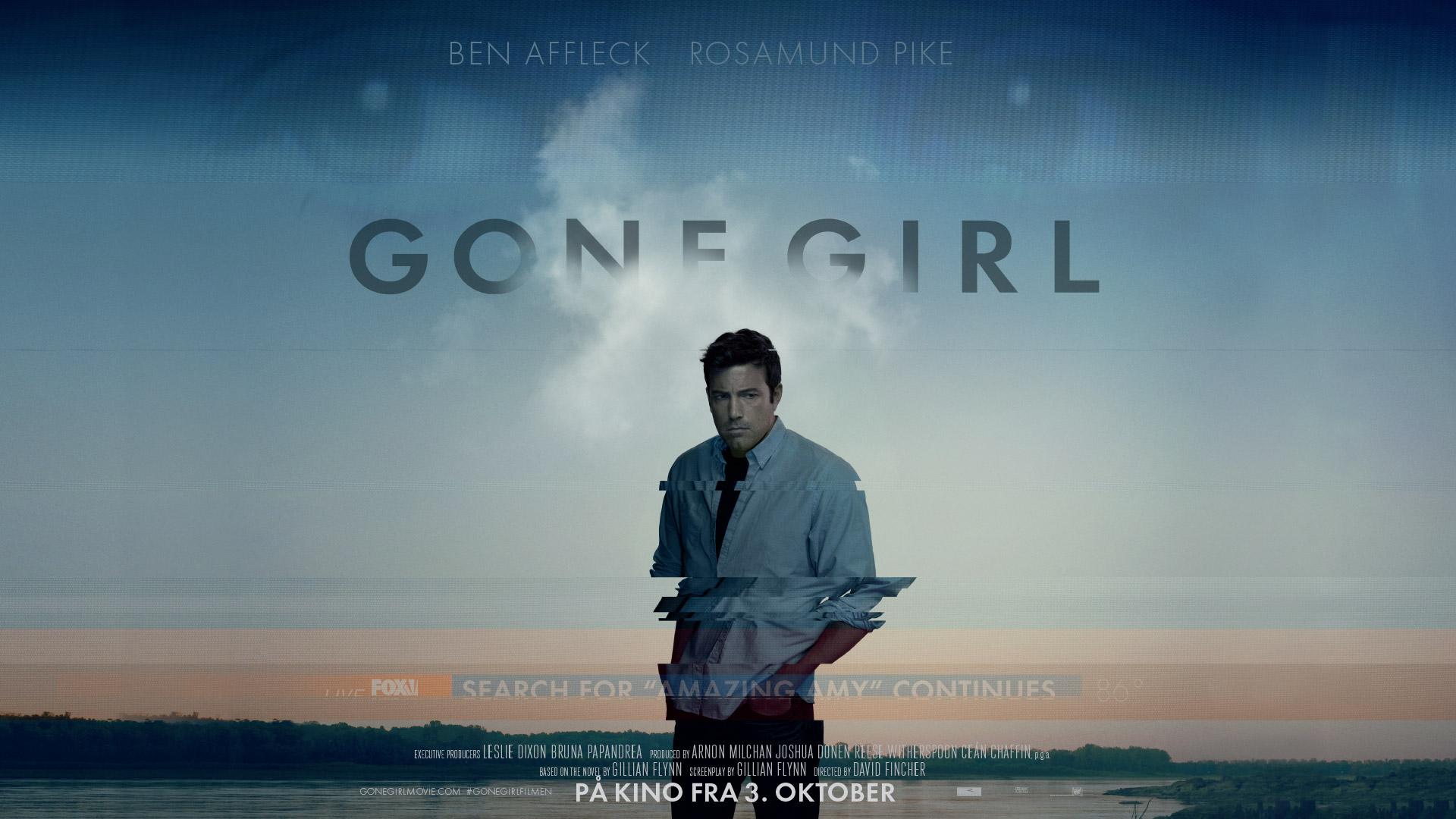
6 Gone Girl
Gone Girl is probably the only book wherein I also love the movie cover.


For the book cover: Again, the black-white-red and the utter simplicity of the design.
For the movie cover: I really enjoyed the Gone Girl adaptation. It properly embodied the mystery and thriller that was the book and it translated really well to their promotionals. This Ben Affleck cover also told more about the content than the original cover, enough to be intrigued. Vague but, if you know what happens, even misleading and completely mysterious. Exactly Gillian Flynn.
Speaking of the movie promotions, I would just leave some space for it here because damn, it is fucking good. The horizon shots kill me.
 |
| Whoever thought of this concept is fucking lit. |


7 Red Queen/Glass Sword
Last but not the least. While I prefer the bloodier and sharper look of Red Queen, both books still look equally amazing on paperback with the crowns embossed. Just. SO. FUCKING. PRETTY.


I love good and creative design very much, especially in books. Personally, it also sends a "feel" of what the story is going to be like and so I believe that book covers aren't just for marketing and attention-getting, it's also the doorstep to immersing you into the world.
No comments:
Post a Comment